Marley came to me buzzing with excitement—she wanted a brand that truly reflected her unique style. She dreamed of something that struck the perfect balance between cute and sophisticated, a brand identity that would be as sweet as honey but with a little sting of sass.
Turning the Buzz into a Design
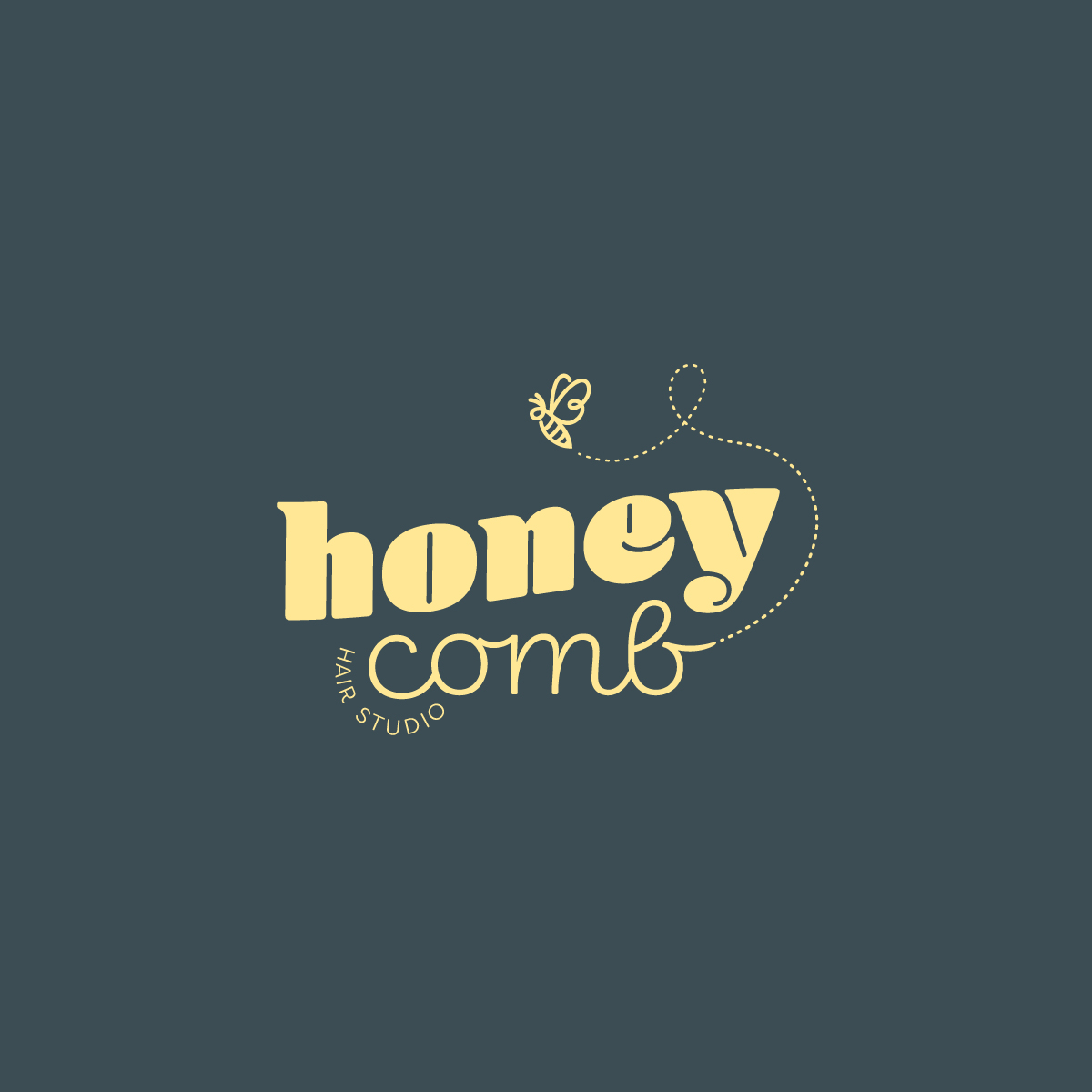
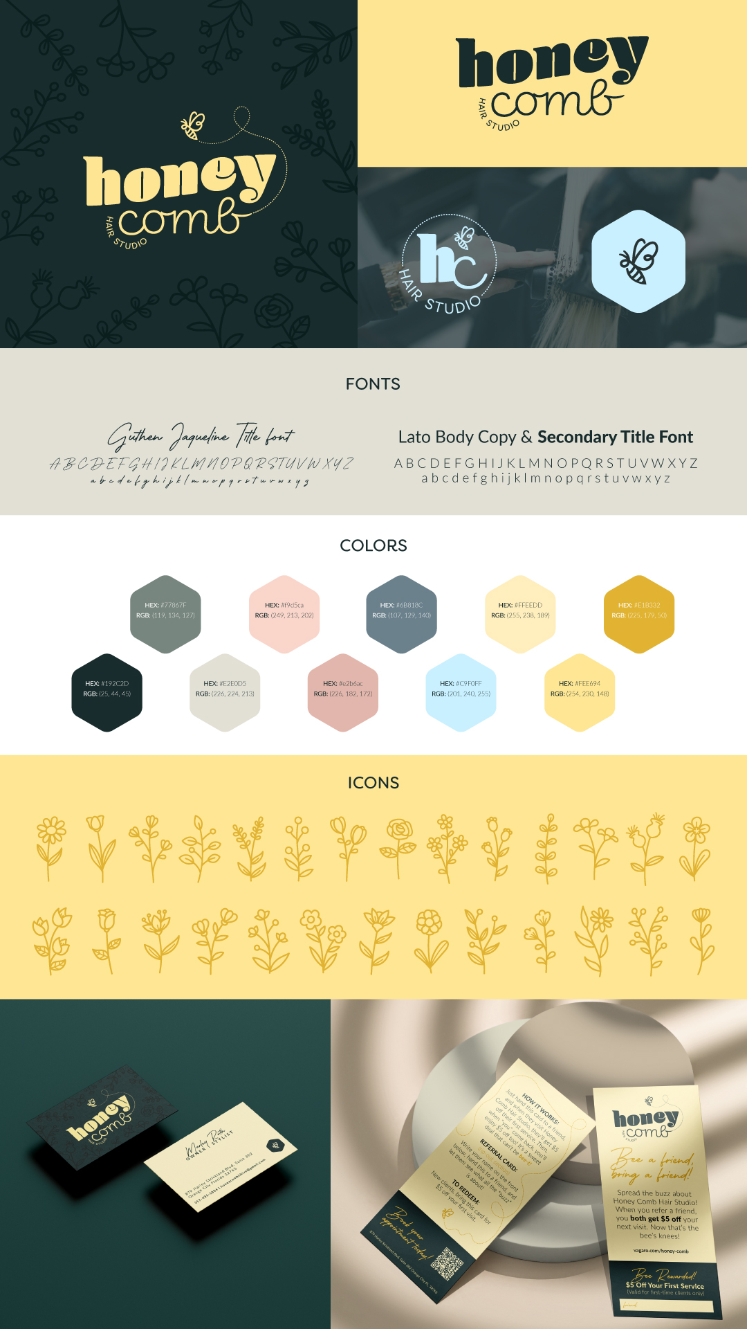
To bring her idea to life, I explored different design variations that were the bee’s knees! We played with bees, a honey-dipped comb, and hexagons to mimic natural honeycombs. After some back-and-forth, we finally landed on a design that was simply un-bee-lievable. Marley was buzzing with joy as we refined the look together.
Bringing the Hive to Life
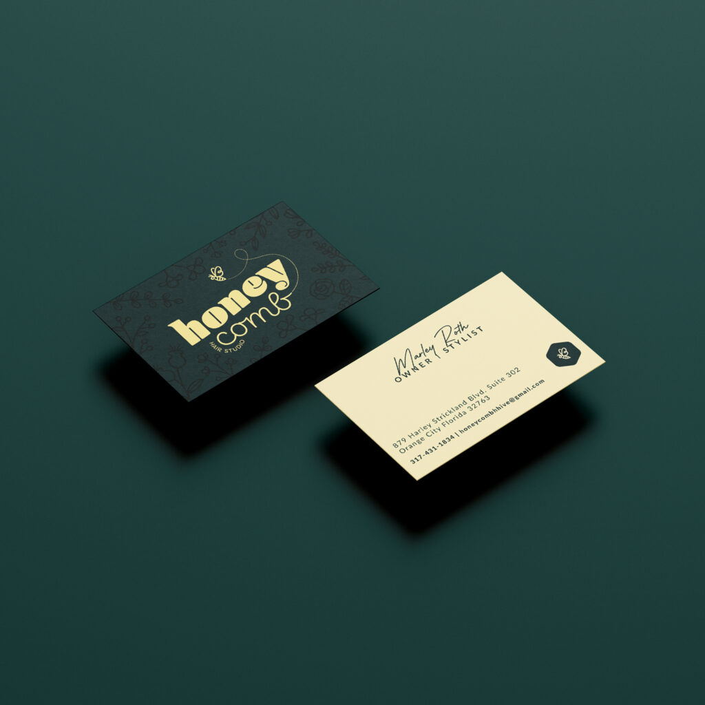
With the logo locked in, I curated a sweet and golden color palette—elegant yet playful, just like Marley envisioned. We picked fonts that had a sassy little sting, giving her brand the attitude it deserved. The whole process was a hive of activity, and working with Marley was a total honey of an experience!
Putting the Final Drizzle on Top
To make sure her brand was as cohesive as a beehive, I guided her in designing her shop. I created an inspiration board dripping with creativity, helping her see how all the elements—colors, fonts, and graphics—would come together. I also coached her on how to keep her brand buzzing beautifully as she moved forward.